CrossFit AxAt (Re-Brand)

CLIENT: Axiom Athletics (CrossFit AxAt)
OBJECTIVE: Re-design the logo with a more professional, modern feel
APPLICATION: Various print and digital mediums
My clients over at Axiom Athletics in Suwanee, GA reached out to me in order to give their logo a much needed update and refresh.
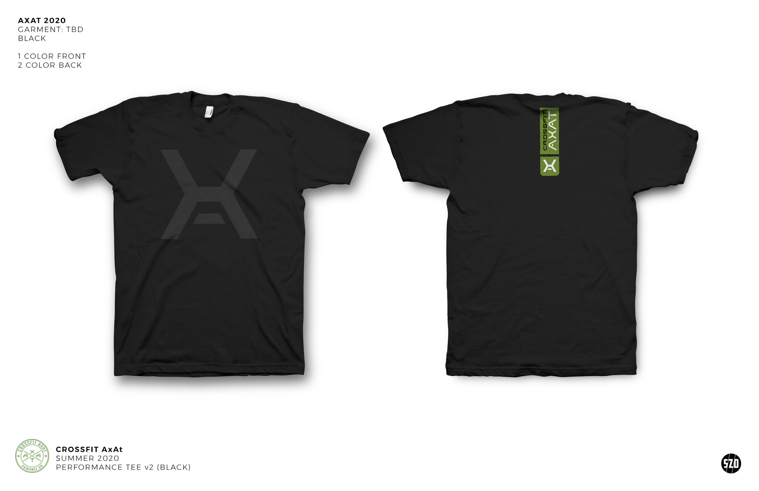
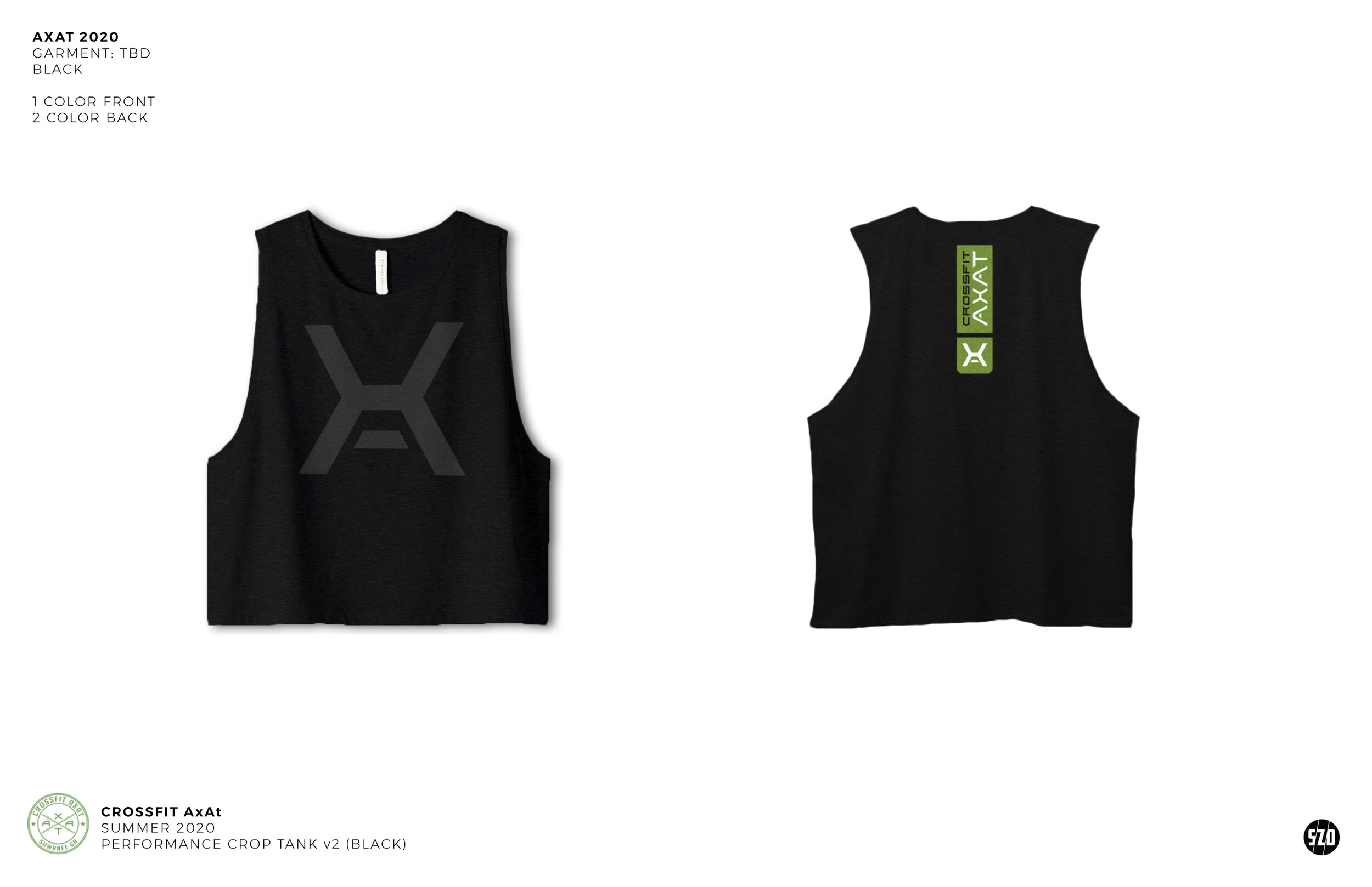
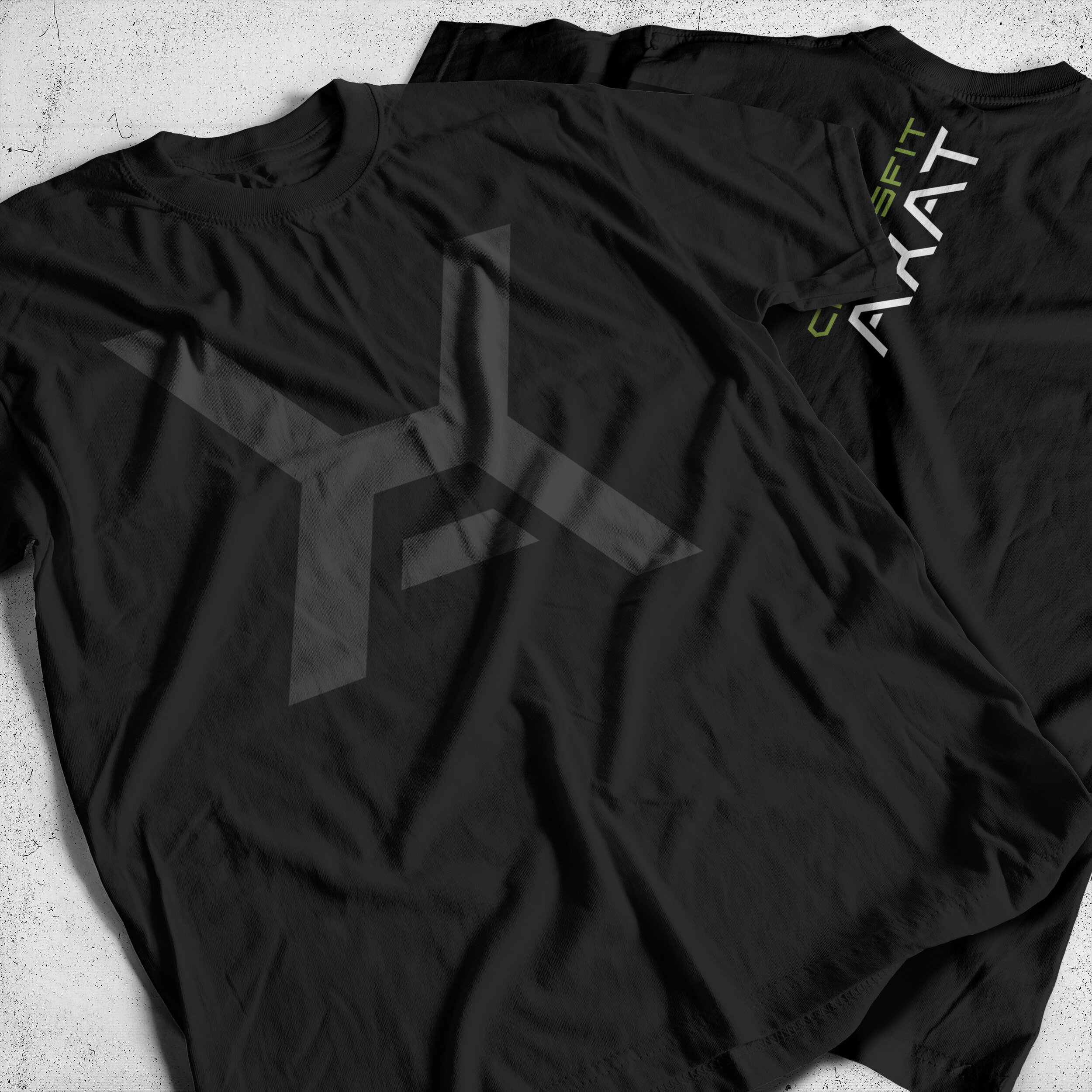
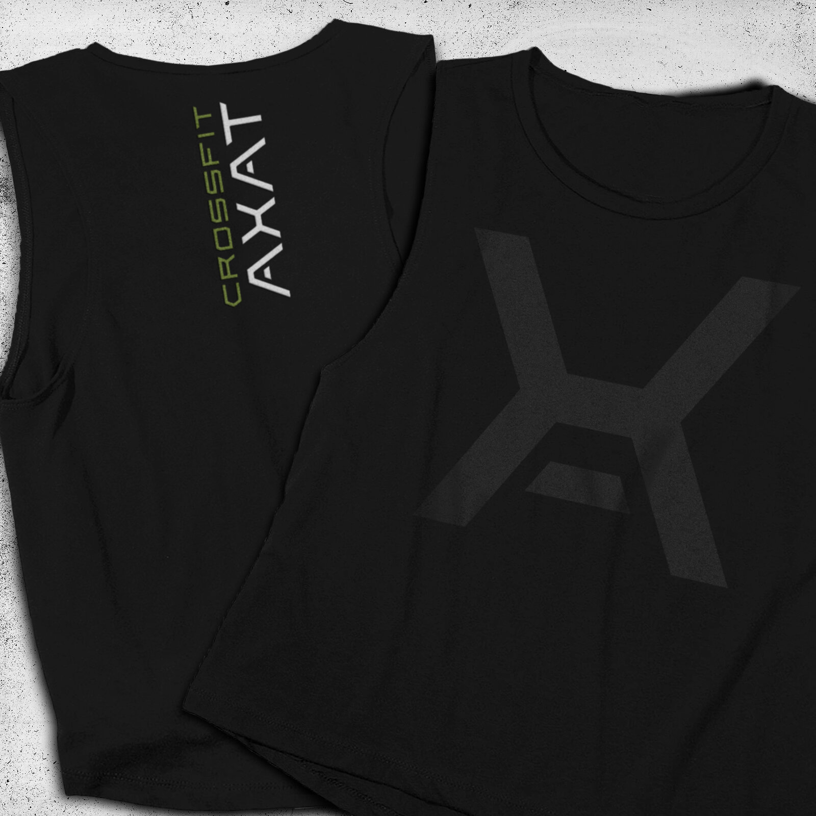
The project initially started with a sample logo that they had worked some time ago which had a rough quality to it and lacked refinement. I began with the main “X'“ icon element of the logo. By adding a floating crossbar I was able to incorporate a stylized “A” into the icon to accompany the "primary “X” design of it; both are letters which feature heavily in Axiom and AxAt’s naming and signage.
Once the icon was approved by Axiom, I then set about creating an alphabet that was defined by the angles and weight of the icon (below). The result was a powerful icon, which, when accompanied by the logotype, presents a strong and uniform logo.